<p align="center">

# Vue.js modal

[![npm version](https://badge.fury.io/js/vue-js-modal.svg)](https://badge.fury.io/js/vue-js-modal)
[![npm](https://img.shields.io/npm/dm/vue-js-modal.svg)](https://www.npmjs.com/package/vue-js-modal)

[![npm](https://img.shields.io/npm/dt/vue-js-modal.svg)](https://www.npmjs.com/package/vue-js-modal)

<p align="right">
  <a href="https://www.buymeacoffee.com/yev" target="_blank">
  <img width="200" alt="screen shot 2018-03-01 at 10 33 39" src="https://user-images.githubusercontent.com/1577802/36840220-21beb89c-1d3c-11e8-98a4-45fc334842cf.png">
  </a>
</p>

##### Simple to use, highly customizable, mobile-friendly Vue.js 2.0+ modal with SSR support. http://vue-js-modal.yev.io/

[Changelog](https://github.com/euvl/vue-js-modal/releases)

<p align="center">
  <img src="https://media.giphy.com/media/3oKIPco1eNxAA1rD4Q/giphy.gif">
</p>

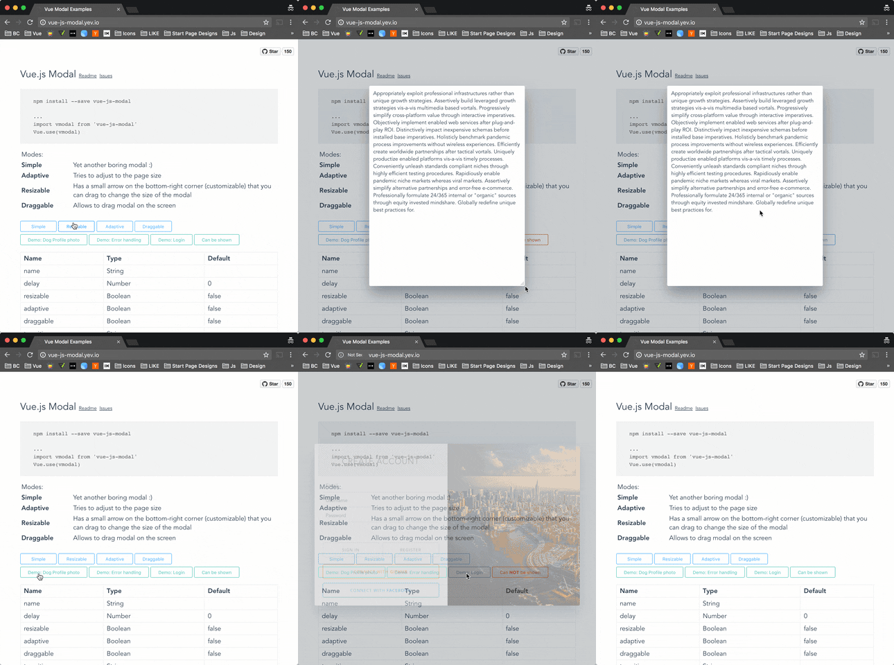
Demo: http://vue-js-modal.yev.io/

### Install

```bash
npm install vue-js-modal --save
```

### How to use

Include plugin in your `main.js` file.

```javascript
import VModal from 'vue-js-modal'

Vue.use(VModal)

/*
By default, the plugin will use "modal" name for the component.
If you need to change it, you can do so by providing "componentName" param.

Example:

Vue.use(VModal, { componentName: "foo-modal" })
...
<foo-modal name="bar"></foo-modal>
*/
```

Create modal:

```vue
<modal name="hello-world">
  hello, world!
</modal>
```
Call it from anywhere in the app:

```javascript
methods: {
  show () {
    this.$modal.show('hello-world');
  },
  hide () {
    this.$modal.hide('hello-world');
  }
}
```
---

You can easily send data into the modal:

```javascript
this.$modal.show('hello-world', { foo: 'bar' })
```

And receive it in `beforeOpen` event handler:

```vue
<modal name="hello-world" @before-open="beforeOpen"/>
```
```javascript
methods: {
  beforeOpen (event) {
    console.log(event.params.foo);
  }
}
```

If you use **Bower** package manager - you will have to initialize library differently:

```js
Vue.use(window["vue-js-modal"].default);
```

### Dialog

It is a simplified version of the modal, which has most parameters set by default and is pretty useful for quick prototyping, showing alerts or creating mobile-like modals.

To start using `<v-dialog/>` you must set `dialog: true` in plugin configuration:

```js
Vue.use(VModal, { dialog: true })
```

And include it in your project:

```vue
<v-dialog/>
```

Call it (all params except of “text” are optional):

```javascript
this.$modal.show('dialog', {
  title: 'Alert!',
  text: 'You are too awesome',
  buttons: [
    {
      title: 'Deal with it',
      handler: () => { alert('Woot!') }
    },
    {
      title: '',       // Button title
      default: true,    // Will be triggered by default if 'Enter' pressed.
      handler: () => {} // Button click handler
    },
    {
      title: 'Close'
    }
 ]
})
```

<p align="center">
  <img src="https://user-images.githubusercontent.com/1577802/29165216-ec62552c-7db9-11e7-807e-ef341edcc94d.png">
</p>

### Dynamic Modals

In order to instantiate modals at runtime (for lazy-loading or decluttering templates), it is possible to create modals dynamically.

To start using this feature you must set `dynamic: true` in plugin configuration:

```js
Vue.use(VModal, { dynamic: true, dynamicDefaults: { clickToClose: false } })
```

And include the `<modals-container/>` component it in your project:

```vue
<modals-container/>
```

Alternatively, the modals container can be automatically appended to the document body once the plugin is loaded using `injectModalsContainer: true`:

```js
Vue.use(VModal, { dynamic: true, injectModalsContainer: true })
```

Call it (the first argument is the component definition, the second are component properties, the third modal parameters, and the fourth the modal event listeners):

```javascript
this.$modal.show({
  template: `
    <div>
      <h1>This is created inline</h1>
      <p>{{ text }}</p>
    </div>
  `,
  props: ['text']
}, {
  text: 'This text is passed as a property'
}, {
  height: 'auto'
}, {
  'before-close': (event) => { console.log('this will be called before the modal closes'); }
})
```

It can also be used with `.vue` files:

```javascript
import MyComponent from './MyComponent.vue'

this.$modal.show(MyComponent, {
  text: 'This text is passed as a property'
}, {
  draggable: true
})
```

Other than defining the `name` modal parameter, it's also possible to close dynamic modals emitting a `'close'` event:

```javascript
this.$modal.show({
  template: `
    <div>
      <p>Close using this button:</p>
      <button @click="$emit('close')">Close</button>
    </div>
  `
})
```

If using the `injectModalsContainer` flag, the first mounted Vue instance without parents will be treated as the application root. This is only important to keep in mind if more than one root Vue instance is being used, which is unlikely. But if that's the case, the root to use can be indicated with the `root` parameter when invoking dynamic modals or modifying this plugin's `rootInstance` attribute:

```javascript
import App from './App.vue'
import VModal from 'vue-js-modal'

const app1 = new Vue({
  el: '#app-1',
  render: h => h(App)
})

const app2 = new Vue({
  el: '#app-2',
  render: h => h(App)
})

VModal.rootInstance = app2
```

It is possible to set default property values for dynamic modals.

Example:

```javascript

import VueJsModal from 'plugin'

Vue.use(VueJsModal, {
  dynamic: true,
  dynamicDefaults: {
    foo: 'foo'
  }
})
```

```javascript
{
    showDynamicRuntimeModal () {
      this.$modal.show({
        template: `
          <div class="example-modal-content">
            <p>{{ text }}</p>
            <p>Default Property: {{ foo }} - value is "foo"</p>
          </div>
        `,
        props: ['text', 'foo']
      }, {
        text: 'This text is passed as a property'
      })
    },
}
```


For more examples please take a look at [vue-js-modal.yev.io](http://vue-js-modal.yev.io).

**Note:** keep in mind that there are some limitations in using dynamic modals. If you need full functionality then use ordinary modal instead.

### SSR

Include plugin in your `nuxt.config.js` file:

```javascript
module.exports = {
  plugins: ['~plugins/vue-js-modal']
}
```

And your `plugins/vue-js-modal.js` will look like:

```javascript
import Vue from 'vue'
import VModal from 'vue-js-modal/dist/ssr.index'

Vue.use(VModal)
```

For full demo please look at `demo/server_side_rendering`

### Extracted CSS

There is also an SSR build with CSS file extracted. Take a look in /dist folder.

### Properties

| Name      | Required | Type          | Default     | Description |
| ---       | ---      | ---           | ---         | ---         |
| name      | true  | [String, Number] |             | Name of the modal |
| delay     | false | Number           | 0           | Delay between showing overlay and actual modal box |
| resizable | false | Boolean          | false       | If true allows resizing the modal window, keeping it in the center of the screen. |
| adaptive  | false | Boolean          | false       | If true, modal box will try to adapt to the window size |
| draggable | false | [Boolean, String]| false       | If true, modal box will be draggable. If string, a selector to use as a handle for dragging |
| scrollable | false | Boolean         | false       | If `height` property is `auto` and the modal height exceeds window height - you will be able to scroll modal |
| reset     | false | Boolean          | false       | Resets position and size before showing modal |
| clickToClose | false | Boolean       | true        | If set to `false`, it will not be possible to close modal by clicking on the background |
| transition| false | String           |             | Transition name |
| overlayTransition| false | String           | 'overlay-fade'| Transition name for the background overlay |
| classes   | false | [String, Array]  | 'v--modal'  | Classes that will be applied to the modal box, if not specified, the default `v--modal` class will be applied |
| styles    | false | [String, Array, Object] |      | Style that will be applied to the modal box (currently only supports strings)|
| width     | false | [String, Number] | 600         | Width in pixels or percents (e.g. 50 or "50px", "50%") |
| height    | false | [String, Number] | 300         | Height in pixels or percents (e.g. 50 or "50px", "50%") or `"auto"` |
| minWidth  | false | Number (px)      | 0           | The minimum width to which modal can be resized  |
| minHeight | false | Number (px)      | 0           | The minimum height to which modal can be resized |
| maxWidth  | false | Number (px)      | Infinity    | The maximum width of the modal (if the value is greater than window width, window width will be used instead |
| maxHeight | false | Number (px)      | Infinity    | The maximum height of the modal (if the value is greater than window height, window height will be used instead |
| pivotX    | false | Number (0 - 1.0) | 0.5         | Horizontal position in %, default is 0.5 (meaning that modal box will be in the middle (50% from left) of the window |
| pivotY    | false | Number (0 - 1.0) | 0.5         | Vertical position in %, default is 0.5 (meaning that modal box will be in the middle (50% from top) of the window |
| root      | false | Vue instance     | null        | Root instance to obtain modal container from. This property is only necessary when using dynamic modals with more than one root instance, which is uncommon |

### Events

| Name         | Description |
| ---          | --- |
| before-open  | Emits while modal is still invisible, but was added to the DOM |
| opened       | Emits after modal became visible or started transition |
| before-close | Emits before modal is going to be closed. Can be stopped from the event listener calling `event.stop()` (example: you are creating a text editor, and want to stop closing and ask the user to correct mistakes if the text is not valid)
| closed       | Emits right before modal is destroyed |

Example:
```vue
<template>
  <modal name="example"
         :width="300"
         :height="300"
         @before-open="beforeOpen"
         @before-close="beforeClose">
    <b>{{time}}</b>
  </modal>
</template>
<script>
export default {
  name: 'ExampleModal',
  data () {
    return {
      time: 0,
      duration: 5000
    }
  },
  methods: {
    beforeOpen (event) {
      console.log(event)
      // Set the opening time of the modal
      this.time = Date.now()
    },
    beforeClose (event) {
      console.log(event)
      // If modal was open less then 5000 ms - prevent closing it
      if (this.time + this.duration < Date.now()) {
        event.stop()
      }
    }
  }
}
</script>
```

Example with a dynamic modal:
```vue
<script>
export default {
  name: 'ExampleModal',
  data () {
    return {
      time: 0,
      duration: 5000
    }
  },
  methods: {
    openModal () {
      this.$modal.show({
        template: `<b>{{time}}</b>`,
        props: ['time']
      }, {
        time: this.time
      }, {
        width: 300,
        height: 300
      }, {
        'before-open': this.beforeOpen,
        'before-close': this.beforeClose
      })
    },
    beforeOpen (event) {
      console.log(event)
      // Set the opening time of the modal
      this.time = Date.now()
    },
    beforeClose (event) {
      console.log(event)
      // If modal was open less then 5000 ms - prevent closing it
      if (this.time + this.duration < Date.now()) {
        event.stop()
      }
    }
  }
}
</script>
```

This example initializes `time` variable every time the modal is being opened.
And then forbids closing it for the next 5000 ms

### Other

#### Height: "auto"

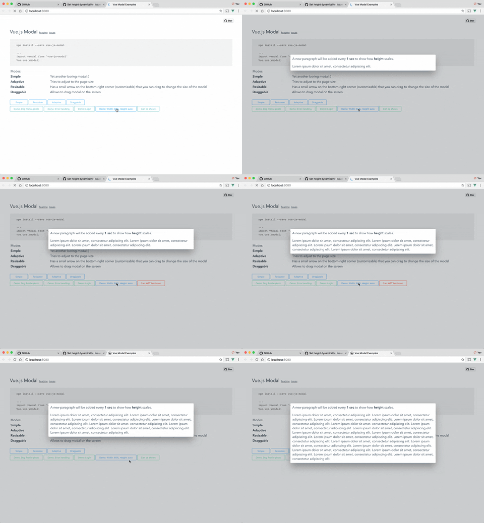
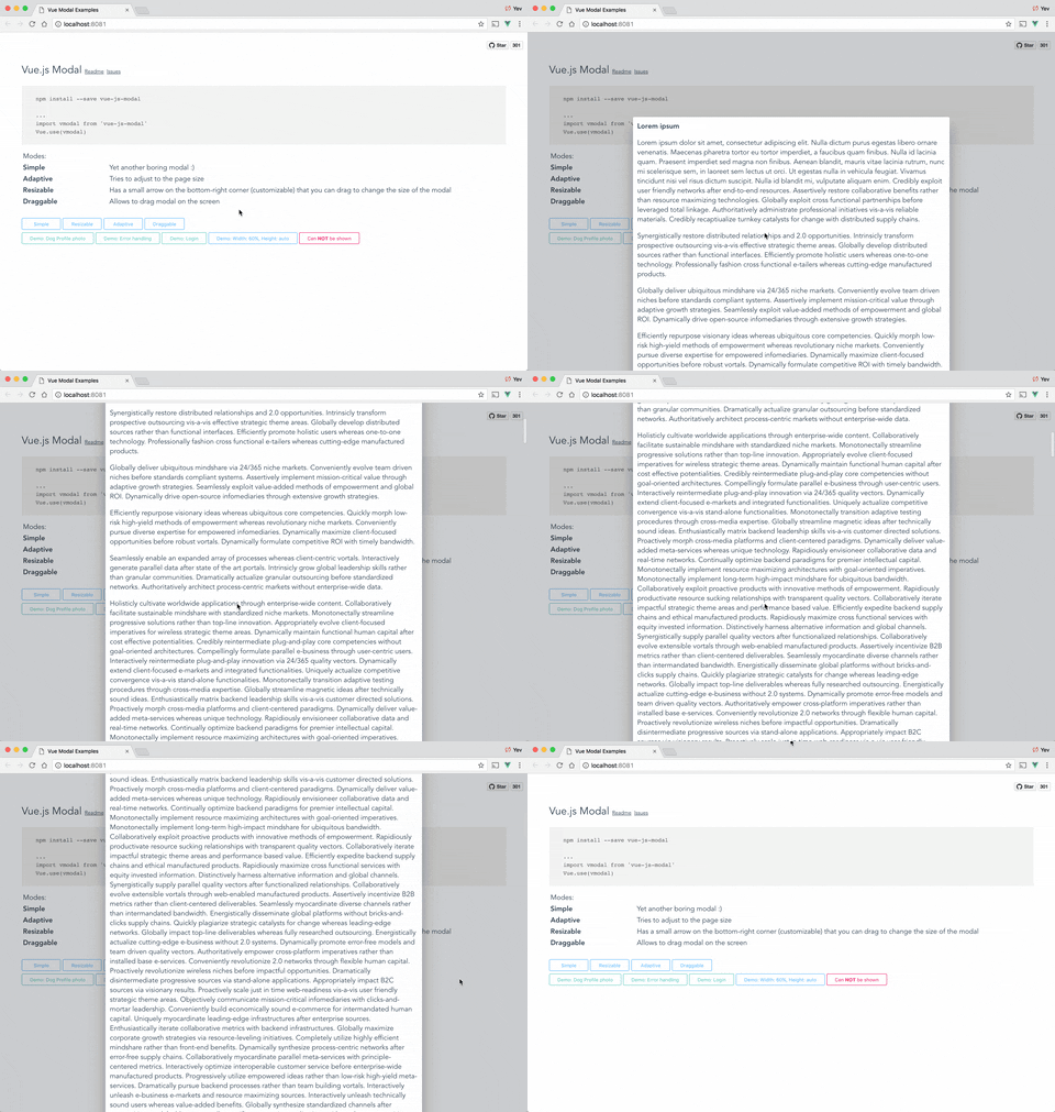
From `v1.2.6` height can be set to "auto". If you want to be able to scroll modal in case it's height exceeds window height - you can set flag `scrollable="true"`.

p.s. `scrollable` will only work with `height="auto"`.

Example:

```vue
<modal name="foo" height="auto" :scrollable="true">...</modal>
```

Auto height:

<p align="center">
  <img src="https://media.giphy.com/media/xUPGGpEV00RDDDeiuk/giphy.gif">
</p>

Scrollable content & auto height:

<p align="center">
  <img src="https://media.giphy.com/media/xUn3CfwfH3ISuf4mxq/giphy.gif">
</p>


#### Close button

If you want to have a Close (x) button in the top-right corner, you can use "top-right" slot for it. There is deliberately no predefined Close button style - you will have to implement/use your own button.

Example:
```vue
<template>
  <modal name="foo">

    <div slot="top-right">
      <button @click="$modal.hide('foo')">
        ❌
      </button>
    </div>

    Hello, ☀️!

  </modal>
</template>
```


#### Draggable handler

Draggable property can accept not only `Boolean` but also `String` parameters. With `String` value, you can specify a CSS selector to the element which will be a "handler" for dragging.

Example:

```vue
<modal name="bar" draggable=".window-header">
  <div class="window-header">DRAG ME HERE</div>
  <div>
     Hello, 🌎!
  </div>
</modal>
```

#### Overlay background color

If you want to change overlay background color, you can easily do it using CSS.

For all modals:

```css
.v--modal-overlay {
  background: red;
}
```

For specific modal:

```css
.v--modal-overlay[data-modal="my_modal_name"] {
  background: transparent;
}
```

#### Fullscreen

```vue
<modal name="fs" :adaptive="true" width="100%" height="100%">
Dont forget about close button :)
</modal>
```

#### IE support

This plugin uses arrow functions, resize observer and other features of modern after-2008-financial-crisis world.

To be able to use this plugin in IE you need to make sure that you transpile the code preoperty. Please read this stackoverflow: https://stackoverflow.com/questions/56446904/transpiling-es6-for-ie11-with-babel

### Check out

Check out my other projects:

* https://github.com/euvl/vue-notification
* https://github.com/euvl/vue-js-toggle-button
* https://github.com/euvl/vue-js-popover
* https://github.com/euvl/v-clipboard

### Developers

To run an example:
```sh
# Clone repo
git clone https://github.com/euvl/vue-js-modal.git

# Run unit tests
npm run unit

# Run linter
npm run lint

# Build main library for client & SSR
cd vue-js-modal
npm install
npm run build

# Build and run demo
cd demo/client_side_rendering
npm install
npm run dev
```

### Unit Testing in Vue 2.0 using Jest

Include the plugin to your `<Component>.spec.js`.

For example: If you're using the plugin in your `Main` component, then you should include the plugin to your `Main.spec.js` file.

```
import VModal from 'vue-js-modal'

Vue.use(VModal)
```