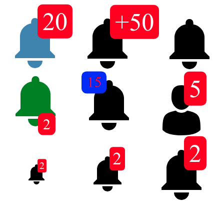
vue-notification-bell

A Vue UI component for showing notifications. [Demo Page](https://mrastiak.github.io/vue-notification-bell/)
## How To Install
```
npm install vue-notification-bell --save
```
## How to use
Inside your vue files:
```vue
```
## List of component props
:warning: Warning: You have to v-bind custom icon path with `require` function:
`v-bind:icon="require(@/assets/path/to/icon.svg)"` :heavy_check_mark:
`:icon="require(@/assets/path/to/icon.svg)"` :heavy_check_mark:
`icon="@/assets/path/to/icon.svg"` :x:
`icon="require(@/assets/path/to/icon.svg)"` :x:
| propName | description | default value |
| ------------------------ | --------------------------------------------------------------------------------------------------------------------------------------------------------------------------------------------------------------------------- | ---------------------------------------------------- |
| `size` | size of component in px | 30 |
| `count` | number of notifications. (zero or below not shown) | 0 |
| `upperLimit` | if `count` is bigger than this number notification shown as `+upperLimit` | 99 |
| `counterLocation` | position of counter box in component. can be one of: `upperRight`, `lowerRight`, `upperLeft`, `lowerLeft`, `top`, `left`, `bottom`, `right` and `center`. **If you set `top` or `left` prop, this prop will be disabled** | `upperRight` |
| `top` | If you want to set a custom location for counterBox, you can set top distance by this prop. You have to pass value with dimension (e.g. `10px` or `20%`). If you set this prop the `counterLocation` prop will be disabled | `null` (Location is calculated by `counterLocation`) |
| `left` | If you want to set a custom location for counterBox, you can set left distance by this prop. You have to pass value with dimension (e.g. `10px` or `20%`). If you set this prop the `counterLocation` prop will be disabled | `null` (Location is calculated by `counterLocation`) |
| `fontSize` | Custom font size for counter. You have to pass value with dimension. e.g. 20px or 1.5em | `null` (Font size is calculated by `size`) |
| `counterPadding` | Custom padding for counter. You have to pass value with dimension. e.g. 20px or 1.5em | `null` (Padding is calculated by `size`) |
| `icon` | custom notification icon. you have to pass your SVG icon location by `require` function | `null` (showing the default bell icon) |
| `iconColor` | color of the bell icon. **This property only works with default icon. if you are using custom `icon`, you have to handle color of the icon in your SVG file** | `black` |
| `disabledIcon` | If you want to show a different Icon when you have zero notification. you can use this prop. pass SVG icon location by `require` function. **this prop only works if you are using custom `icon` too** | `null` (showing the default bell icon) |
| `counterStyle` | shape of counter box. can be one of: `roundRectangle`, `rectangle`, `round` | `roundRectangle` |
| `counterBackgroundColor` | background color of counter box | `red` |
| `counterTextColor` | counter text color | `white` |
| `animated` | if true, counter increase/decrease by animation | `false` |
| `prefixPlus` | if true, upper limit plus sign is shown as a **prefix**, otherwise it is shown as a postfix | `false` |
## Contributing
Visit [CONTRIBUTING Page](https://github.com/Carrene/vue-notification-bell/blob/master/CONTRIBUTING.md)
### Compiles and hot-reloads for development
```
npm run serve
```
### Compiles and minifies for production
```
npm run build-bundle
```
### Lints and fixes files
```
npm run lint
```
### License
MIT